I did try to have a go at lighting two weeks ago and I am still working on it.
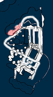 |
| My first attempt, really bad I have got too much contrast between white and the dark blue background (they don't blend together). |
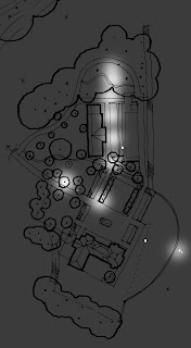 |
| With the help of Susan W, I was able to come up with a better lighting on the plan. Using a different rubber make such a difference. Dark grey background. |
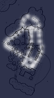 |
| This plan is my newest example I have been working on with darker blue background. |
I am trying now to find a way to have yellow/orange lighting on the plan. I try with the lighting filter but it is not working on my plan. Hopefully on my final plan it will work.


Nice one Amelie, but I think we're supposed to stay clear of any coloured lighting effects...I might be wrong. But it might save you the trouble trying,
ReplyDeletex S
hi amelie,
ReplyDeleteone way to add a coloured effect would be to create another layer between the background and the blue, with a 25% opacity, then when you burn through the blue you will see the colour as a tint
jamie
Looking good, a lot to be inspired by!
ReplyDeleteLooking forward to seeing the rendered plan with some lights