Sunday, 27 March 2011

Lighting on photoshop 2

I have try what Jamie advises me to do and it work perfectly.
I just need to work more on opacity and it will be perfect.
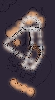
plan +one layer of orange + one layer of dark blue. Then just used the rubber and various opacity and rubber size.
Looking at it again. I definitely need more opacity on the orange lighting. I think it will work well on my rendered plan using that technique.

Tuesday, 22 March 2011

Lighting on photoshop

I did try to have a go at lighting two weeks ago and I am still working on it.
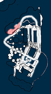
My first attempt, really bad I have got too much contrast between white and the dark blue background (they don't blend together).

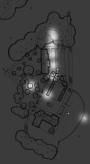
With the help of Susan W, I was able to come up with a better lighting on the plan. Using a different rubber make such a difference. Dark grey background.

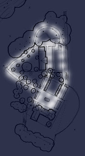
This plan is my newest example I have been working on with darker blue background.
I am trying now to find a way to have yellow/orange lighting on the plan. I try with the lighting filter but it is not working on my plan. Hopefully on my final plan it will work.

Sunday, 20 March 2011

Model

I have spend two days doing my model at 1:200. But I am so pleased with the result. My only challenge was the scale and the changed of level. To get all the level right took me one day.


After taking lots of picture of my model I try to have a go with photomontage.
 My first photomontage took me 3-4 hours as I try various filter before finding the best one. Here is a few filter I try. I also played with the brightness and the contrast.
rough pastel filter

smuge stick

Finally grain filter: the one I prefer.
Adding people and a background make such a difference to the model. Here I think the only detail I need to add is a bit of blue for the sky.

Tuesday, 8 March 2011

Quick Sketches & Sketch-Up

As some of you wanted to know how I manage to do my sketches I decide to do an explanation. Adele is the one which actually inspired me when she adviced me to use Sketch-Up in order to draw my sketches with my height and scale right.
So that's how I decide to use Sketch-Up and the result is impressive. Now I can draw lots of sketches in no time with my scale right.

Here is an example of my Sketch-Up drawing:

Methods:

I decide to put in Sketch-Up only the height of structure, trees as well as people. (you probably realised there are the same people). But it is just a way to put your plan in 3D quickly without to much details. After I select my area at eye level I print it and I draw on top of it on a tracing paper. Then I select some people from photos I took myself and I just add them in my sketches at the right scale.


Below you will find more example of sketches done with the help of Sketch-Up
It is simple, easy and quick. I really recommend to anyone to do the same. It is such a quick way of sketching your design and to have a visual impression of your design in order to improve your design.
Tuesday, 1 March 2011

Lighting

I went this Saturday to observe the lighting at Canary Wharf and at Liverpool street station.

Canary Wharf:
I discover the very good lighting at Canary Wharf. Walking up there was like walking in day light. They used white lighting post along all the paths and yellow lighting on the one jet fountain and on the trees.
Path very well lighted with those light post directing the white light toward the path.

Again we can observe a strong lighting. We can observe that the trees have an earthy tones to create a warm atmosphere.

I think the lighting is strong due not only to the fact that the lighting has power but also due to the fact that the leaves have fallen. We must not forget that this photo has been taken in winter.


Here we can see more distinctly the orange lighting on the trees.

Very decorative lighting.


Lighting orange on the one jet fountain (3 light spots)

Light on the square. It is used more as a decoration here.

Liverpool street station:
I was looking for the garden Jamie and Julia told us to have a look unfortunately I couldn't find it. But I walk around the station and I discover some interesting lighting.
Strong light coming from those big light post.

Lights are also been put on the wall for safety purposes. So people realised that this wall exists.

Lighting on handrail very good idea.


Lighting on paving.


Good way to recognize wall in the dark.

Lighting on paving allows us to identify where some obstacles are such as trees, wall, handrail, etc...


Since visiting Canary Wharf and Liverpool Street Station I have got a better idea of the lighting I should used. I will do more researches on lighting effect on plants when they are full of leaves (spring and summer effect) for next monday.